I’m sure everyone has seen websites that don’t look that great or are annoying with all kinds of pop-ups all over the screen that make the user experience on the site frustrating and negative, or sites that look really boring, dated, or hard to see things. These are serious issues because no one is going to want to visit a site like that, spend time there, or even want to return again. That means you just lost a potential customer and business.
What do you do if you have a lot of issues with your website? Well, you may have to do some rebranding, or at least make some changes to your site. Try to step back and be objective and see it from your user’s perspective. Let’s take a look at this more closely. We’ll give you some real-world examples of great websites, so you can see what we mean.
First, we’re going to look at UI/UX and have brief explanations on both. UI stands for user interface and UX is for user experience. User Interface is the space where interactions between humans and a product occur, such as buttons. UX is everything the user interacts with on your website, so it’s much broader in scope. Remember, User Interface is a part of User Experience, but there is a difference between the two.
User Interface (UI)
UI Design fundamentals are:
- Predictable and seamless elements, such as buttons
- Effective navigation, such as clearly labeled icons
- Frictionless and invisible interactions
- Purposeful and clear tasks or goals
- Guided behavior with design patterns, and clear hierarchy and readability
- Key features grab the user’s attention
UI design focuses on the presentation and interactivity. User interface design includes anything that focuses or tests the design’s look, feel interactivity, animation, responsiveness, adaptation to all device types, and implementation with a developer.
Aesthetically pleasing and functional
Good UI design should be aesthetically pleasing and functional. The UI design should please users, both aesthetically and experientially. The problem is this means something different to almost every single user. Depending on your user, this can include clever animated interactions that highlight certain functions, or it can be a simple, concise and clean design that effectively uses white space to induce a sense of calm.
User Experience (UX) Design
UX is not only UI. It is the combined experience of the user on your website. UX refers to how people interact with your website. For example, when people use your website they are evaluating their experience with it by asking questions such as:
- Does it work?
- Is it easy to use?
- Is it easy to navigate?
- Is it pleasant to use?
- Does it give me value?
Don Norman, co-founder of the Nielsen Norman Group, coined the term “user experience” in the 1990s. According to Norman, “User experience encompasses all aspects of the end-user’s interaction with the company, its services, and its products.”
Here are a few UX design fundamentals.
- User testing
- Data analytics
- Site mapping
- User satisfaction
- Prototyping
- Collaboration
UX designers are people who design for UX. Basically, UX design is the process of creating products (digital or physical) that are practical and usable. UX design covers the entire spectrum of the user experience in order to create a seamless interaction between a user and the company. It includes the overall function and usability of the site. In other words, it is centered around the user. For example, the best websites make it easy for users to find features. It makes it easy for users to complete a desired action without requesting too much information. It loads quickly. It is visually appealing. I think a good UX is when a user can achieve a certain objective in the easiest, fastest, and most pleasurable way possible. In summary, it makes the user experience great, so users love it and want to return. That is the ultimate goal of your website.
Best Websites for UX Experience
To give you an idea of what we’re talking about, let’s check out some of the best UX websites.
Airbnb
AirBnb is an American online marketplace company based in San Francisco, California, United States. They offer arrangements for lodging–primarily homestays– or tourism experiences.
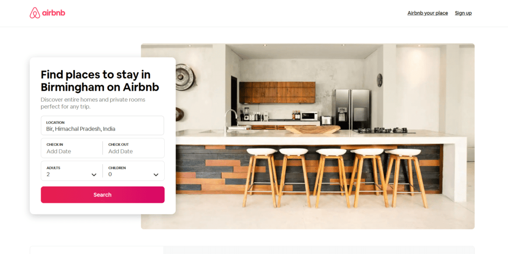
What we like about AirBnB’s UX:
- The first thing you notice is the beautiful pictures that take you to your destination.
- A minimal amount of words are used since the images tell you everything.
- Browser with the main actions of how to get a place to stay and experiences clear. A third category was added due to COVID-19, which has led to change their whole strategy.
- The menu remains in the header (because it’s the most important call to action (CTA) that the user needs/can do on the site), but it changes from the original to give more importance to the “Introducing Online Experiences” section.
Credit Karma
Credit Karma is an American multinational personal finance company founded on March 8, 2007. It offers everyone no-cost, frequently updated credit reports and scores from two big-name credit reporting agencies (Equifax and TransUnion).
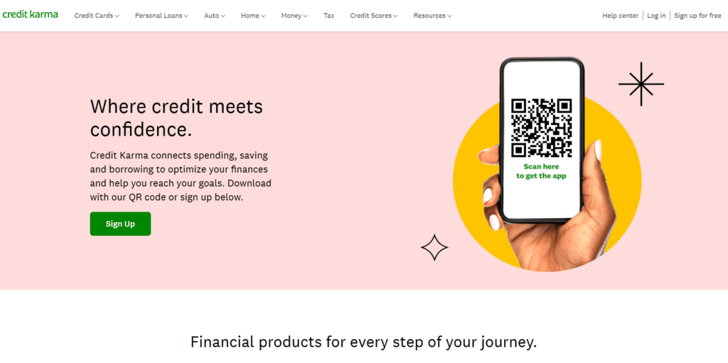
- Credit reports help users catch problems early, improve their credits, and boost their financial knowledge.
- It helps you keep an eye on your credit report more frequently, keeping up with any potential errors. It also provides credit scores, which you do not get for free through other methods.
What we like about Credit Karma’s UX:
- Clean, uncluttered design with some pops of color and images that go tell their story.
- Clear call to action (CTA) in a bright colored button.
- Clear financial dashboard of information is separated by categories with relevant information on the latest interactions and/or actions that need to be taken.
- Tailored suggestions based on the provided information.
- Comparative credit scores with a visual and colored overview, accompanied by a copy, make the user immediately understand the situation.
- Clear description of where the information was taken and the system used provides a sense of security and trust for the user, who shares personal information with the site.
Google Store
As with most of the best UX websites, the Google Store has a minimalist design, making it easier for users to find the options they want. However, the main reason why the Google Store appears on a list of the best user experience websites is the speed of the site.
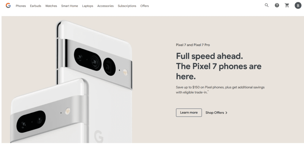
The Google Store typically loads within one or two seconds, as Google understands the importance of fast-loading websites. Every second that a user waits for the screen to load increases the chance of the user leaving the site.
What we like about Google’s UX:
- Lightning speed of loading website.
- Super clean uncluttered design.
- Call to action is very clear.
- Google also simplifies the checkout process, eliminating unnecessary questions. These details appeal to users, resulting in greater satisfaction with the store and more repeat customers.
Mural (mural.co)
Mural is both a platform and a professional service that enables innovative teams to think and collaborate visually to solve problems. It’s a real-time whiteboard where the users can share notes, be creative, organize and prioritize thoughts faster, and dive into its collection of frameworks and templates to guide sessions.
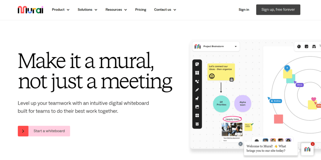
What we like about Mural’s UX:
- Plenty of white space, uncluttered design with visual pops of color that tell their story.
- Call to action is clear and obvious.
- Scroll down and see bright, visually appealing images that strenthen the message.
- They are cloud-based, so it can be used anywhere, from any device.
- Although they are headquartered in Buenos Aires and San Francisco, their teams are spread across the world. They follow the saying “we practice what we preach” by working remotely.
- Icons that help the user to understand where they are. Those icons will guide them throughout the whole experience.
- Clear step-by-step instructions. Whenever you are invited to experiment with one of the features of the platform, a clean window pops up explaining the step-by-step in a clear and simple way.
Notion
Notion Labs Inc. is a startup based in San Francisco, founded in 2016. It’s a tool that blends your everyday work apps into one. Users can access a convenient way to write, plan, collaborate, and get organized – all in one tool.
Notion is a workspace, collaboration, and platform with markdown support that integrates kanban boards, tasks, wikis, and databases. It is available on desktop, laptop, and mobile: iOS and Android. They have interactive step-by-step and clear information about the main actions that can be done in the app.
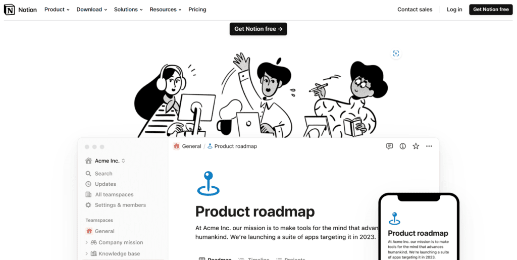
What we like about Notion’s UX:
- Site shows the app and website view at the same time. This gives users an idea of what to expect and also shows its versatility.
- Plenty of white space and black and white color scheme with pops of color to draw your eye where needed.
- Clear icons and an index of what the user is viewing.
- Simple, direct, and valuable language, providing clear CTAs.
- Interactive animations of how the product works show their capabilities more than words can.
- Use of known icons to refer to their categories.
- Clear explanations with overviews.
PayPal
PayPal has updated its site in recent years with several of the website user experience best practices. The site now has a more streamlined interface, making it easier for users to find specific functions, such as copying invoices or generating reports.
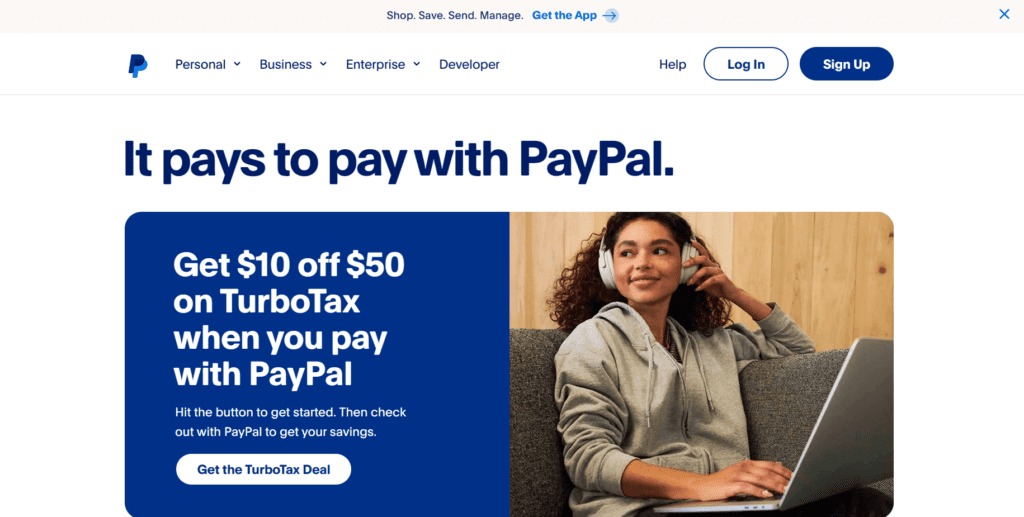
What we Like about PayPal’s UX:
- Clean, simple design with clear navigation.
- PayPal is one of the best user experience websites in fintech with a design that is clean, without fancy graphics, or unnecessary features.
QuickBooks
QuickBooks, the best-selling financial software, has an impressive web-based interface. Users can access a convenient dashboard from the home page that provides more information about the features found within the rest of the product. This is a great example of how to seamlessly insert ways for users to explore more.
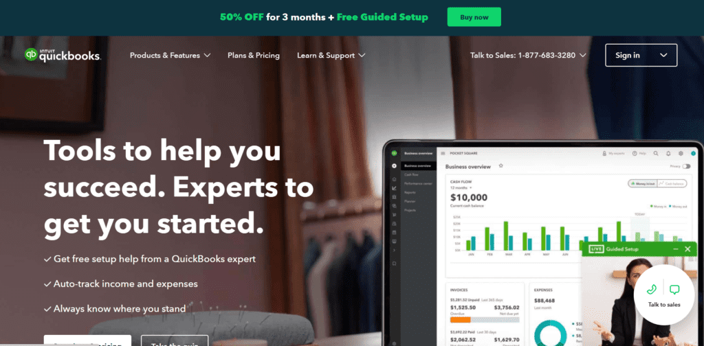
What we Like about Quickbook’s UX:
- One of the great things about Quickbooks is that it works on any device. This means users have access to their key financial data from a desktop, laptop, smartphone, or tablet.
- It also provides an easy to navigate interface. This ease is the #1 reason Quickbooks is a top contender in the best UX websites.
Rover
One of the best UX websites is a network helping connect pet owners with pet sitters and dog walkers.
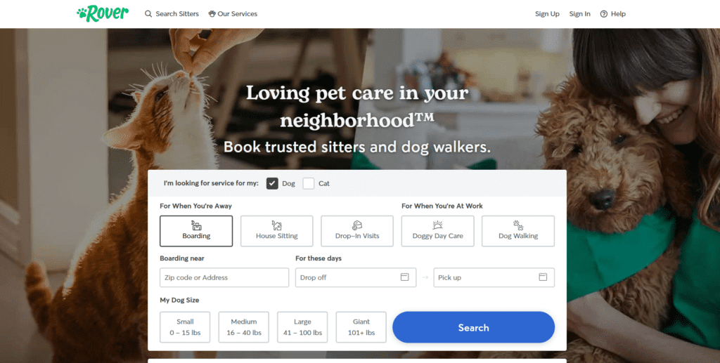
What we Like about Rover’s UX:
- Rover provides an incredibly clean and easy-to-follow interface.
- First-time visitors can quickly find someone to help with their pets across the U.S. or around the world.
- Rover only requires visitors to answer a few simple questions to start using its services.
Conclusion
We hope you enjoyed this post about Websites and UI/UX. We are passionate about helping people create great websites. If you would like more information read below for other articles and reference books on this topic.
Other Articles
Other articles you may be interested in are:
How to Create Stunning Websites in WordPress
Why you Must Have an Author Website
Reference Books
If you would like to know more this topic these are some books we recommend.
Disclaimer: We use affiliate links on our website. As an Amazon Associate I earn from qualifying purchases.


